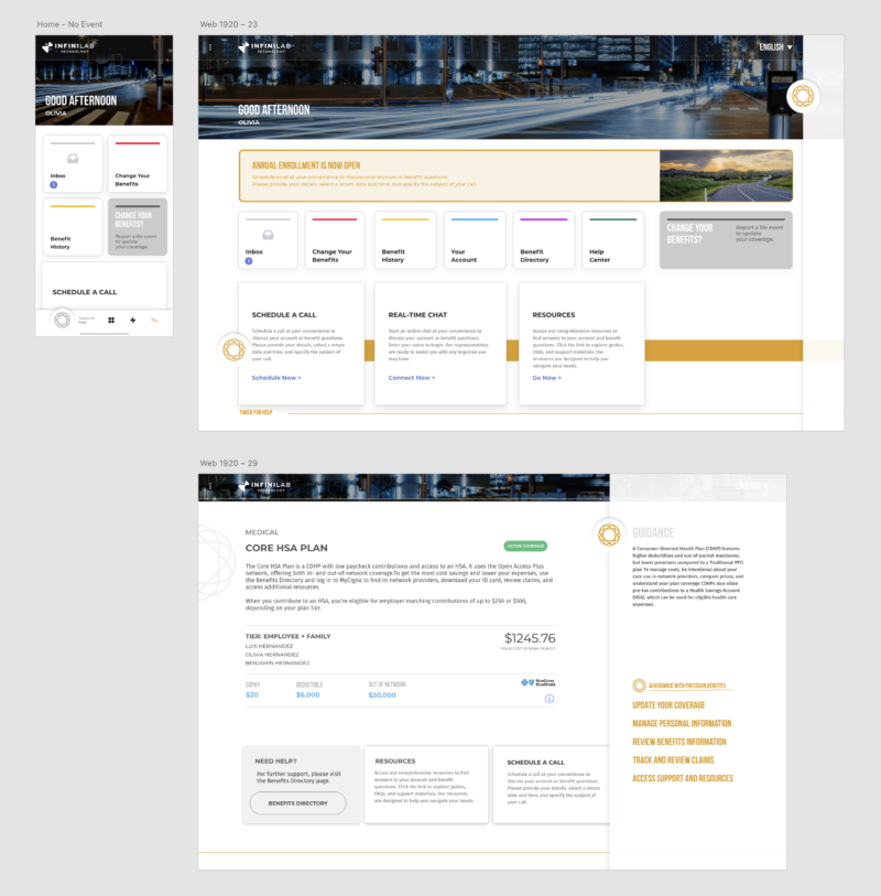
Tagline: “All in one place. Everything visible. Everything equal.”
Overview: This concept is the architectural foundation for BenefitsGO. It is a Tier-1 visual framework in which Inbox, Change Benefits, Benefit History, and Help Center carry equal prominence. It gives consistent navigation across web, mobile, and kiosk.
Design rationale: The concept draws on Jakob Nielsen’s usability heuristics and Google’s Material Design. It favors recognition over recall, with clarity, proximity, and simplicity. The goal is for users to feel anchored, confident, and in control during benefits decisions.
Market parallels: Salesforce Lightning Experience, Google Workspace, and Apple iCloud. Each uses standardized, equal-weight access to build familiarity and trust.
Strengths:
- Clear, intuitive structure for all user types
- Consistent experience across devices
- Builds trust and platform credibility
- Easy to implement and scale as a foundation
Risks and limitations:
- Treats all content equally, so urgent items are not prioritized
- Engagement is passive, because the user must initiate interaction
- Limited personalization and adaptivity
Strategic position: This concept grounds Empyrean’s brand in order and usability. It honors the existing BenefitsGO architecture and gives the later intelligent models a stable base. It is the lowest-risk, fastest-to-deliver option.