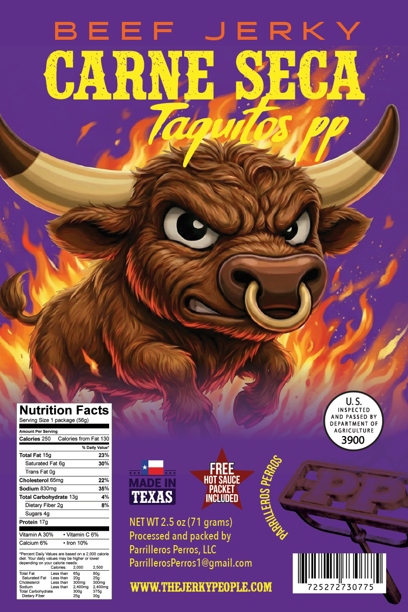
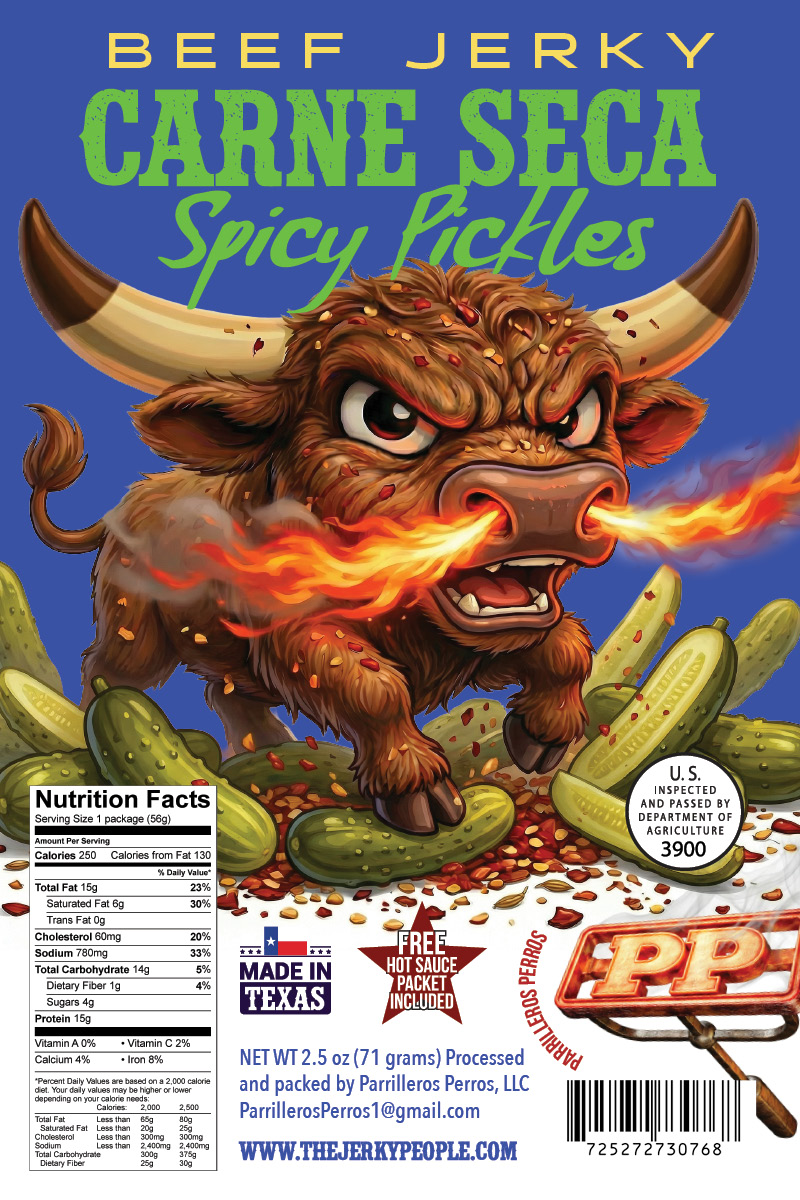
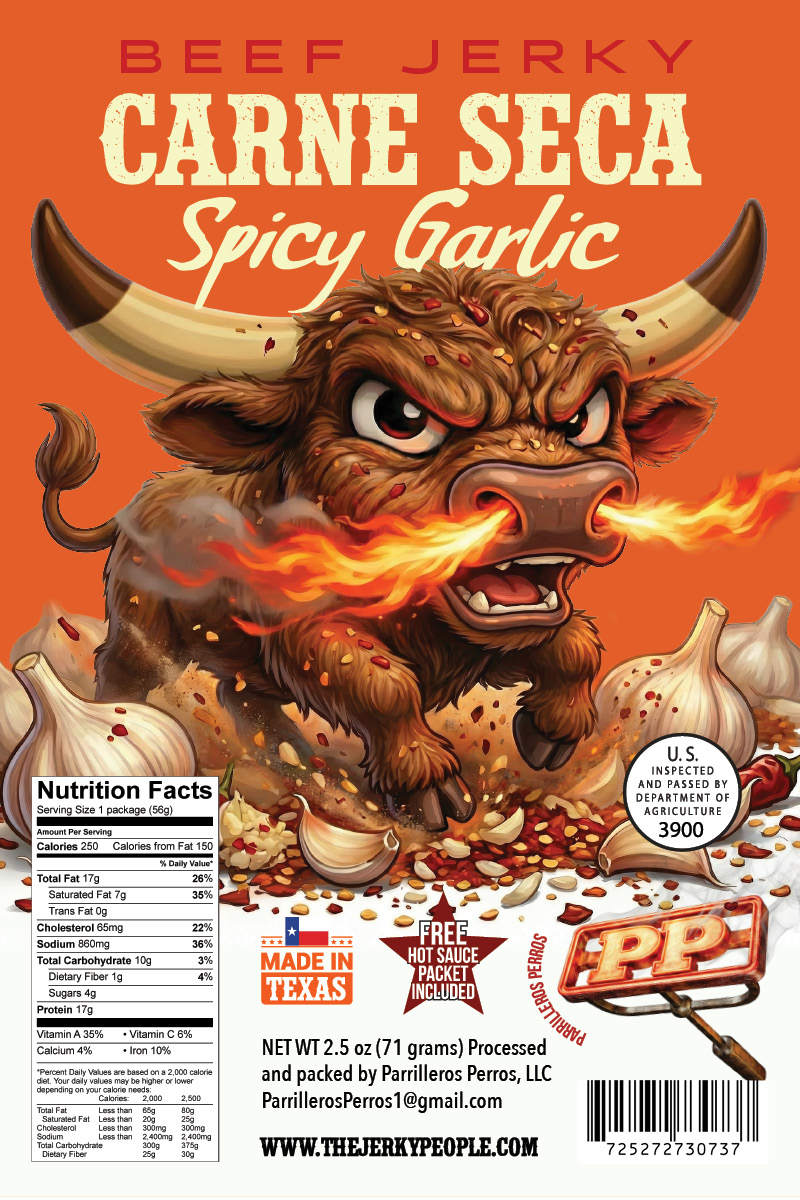
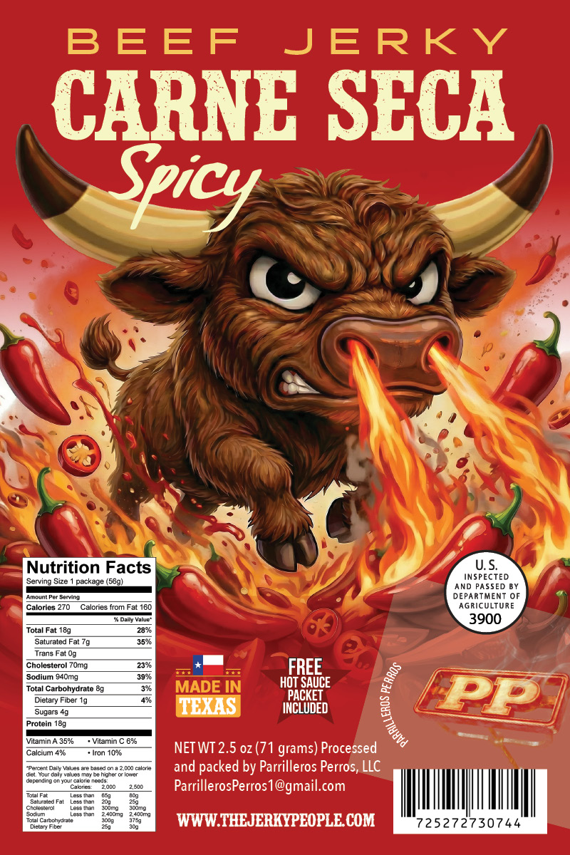
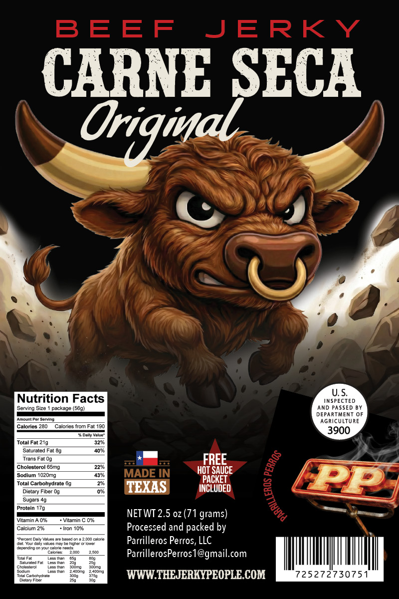
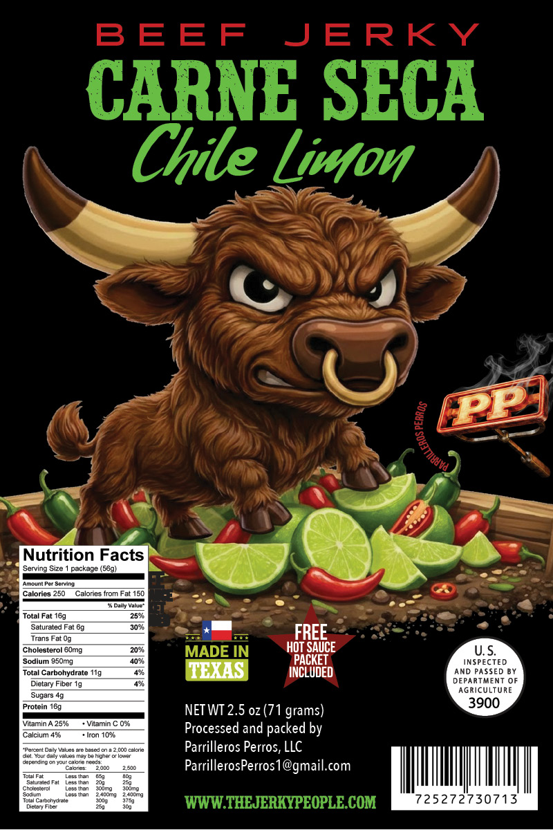
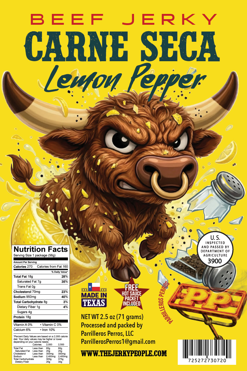
Parrilleros Perros brings bold, grill-fired flavor to the jerky market — and their packaging needed to match that energy. The challenge was translating the brand’s personality into shelf-ready label designs that feel distinctive, appetizing, and consistent across a full product line.
The Approach
The design process started with understanding the brand’s core identity — its roots, its tone, and who it’s speaking to. From there, the label system was built around strong visual hierarchy, appetite-driven color choices, and typography that carries character without sacrificing readability.
Each flavor variant needed its own personality while staying cohesive as a family of products. The result is a label suite that works whether a customer is discovering the brand for the first time or reaching for their favorite variety on repeat.